Chapter 6 Introduction to PCA and multivariate data
Multivariate data is defined as a set of (multiple) response variables measured on the same set of samples. In principle these response variables can be of any nature (continuous, ordinal, binary), but mostly PCA is used for analysis of continuous variables.
In this book Principal Component Analysis (PCA) is used several times. This chapter will shortly explain the theory behind PCA and the interpretation of relevant plots.
PCA is a tool for looking a correlation structure between variables, and groupings of samples. All through visualizations.
Check out YouTube on the subject for an introduction.
A conceptual introduction is given here:
6.1 A bit of math
The multivariate dataset is organized in a matrix \(\mathbf{X}\) with \(n\) samples and \(p\) variables. This matrix is factorized into so called scores (\(\mathbf{T}\)) and loadings (\(\mathbf{P}\)).
\[ \mathbf{X} = \mathbf{T}\mathbf{P} + \mathbf{E} \]
This estimation is done such that the residuals (\(\mathbf{E}\)) is minimized in a least squares sense. The upside of using PCA is that we characterize the sample distribution (what is similar and different) using plots of \(\mathbf{T}\), and the correlation of the responses using plots of \(\mathbf{P}\).
In addition to PCA there exists a range of methods for factorizing multivariate datasets including Partial Least Squares (PLS), confirmatory factor analysis (CFA), Correspondence Analysis (CA), Redundancy Analysis (RA), and a lot more. Conceptually, all these methods aims to make a latent-factor model just like PCA, and hence understanding the idea and especially how PCA is used, opens up for using a wide range of variants.
6.2 Interpreting model output
For calculating a PCA model, we will use the dataset beef. It is a sensory descriptive profile on vacuum packed beef steaks heat treated in water baths at different temperatures for different times (sous vide) In total 12 combinations. The samples are coded as e.g. 56-03, meaning the sample has been treated for 56 degrees for 3 hours. There are 10 assessors in the panel, four sensory repetitions and 22 attrributes (A-Brownsurface to T-Salt).
The first 3 columns of the dataset is used for the design. The PCA is computed on the response variables only.
These can be chosen using the hard brackets []. The way to chose only a part of a dataset (to subset) is done by specifying the following inside the []: A dataset often has two dimensions, rows and columns. In this case, the [] takes two inputs: which row you want, and which columns you want. These are seperated by a comma. This means, that if you write: dataset[1:4,2:6], the result will be rows 1-4, of columns 2-6. If nothing is written on one side of the comma, all of the rows/columns are chosen.
6.2.1 Biplot
The ggbiplot package (and function) is a needed tool to plot the PCA model.
Installation of this is done by:

The PCA tries to capture the maximum structure of the data in a few dimensions called principal components (PC1, PC2,…).
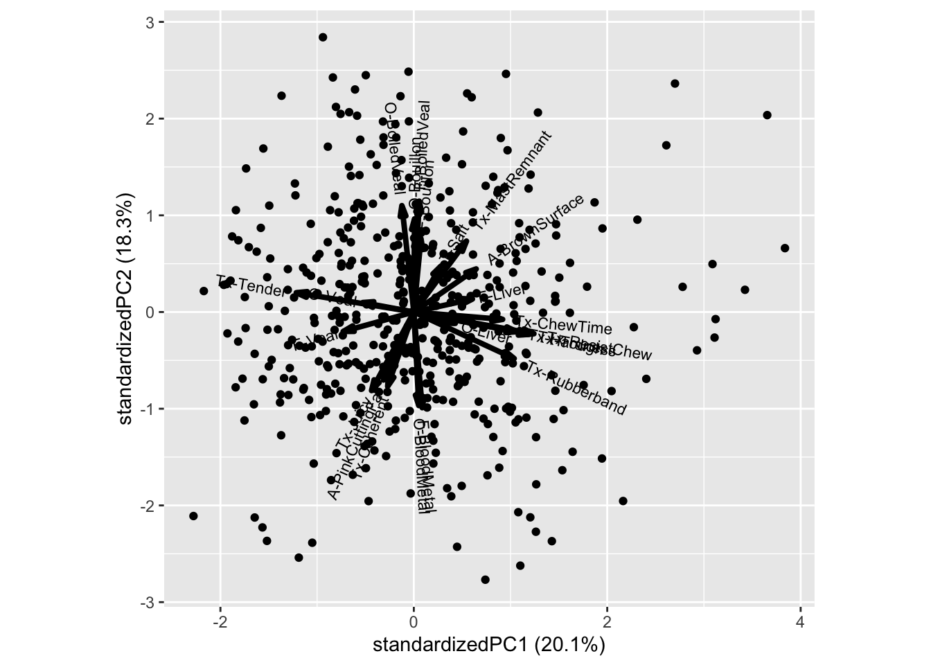
The arrows and labels reflects the correlation structure between the responses. I.e we see that the Bouillon characteristics is correlated and explains PC2, while textural properties like Rubberband, Chewtime is correlated, and oppositely correlated of Tender, and collectively explains PC1.
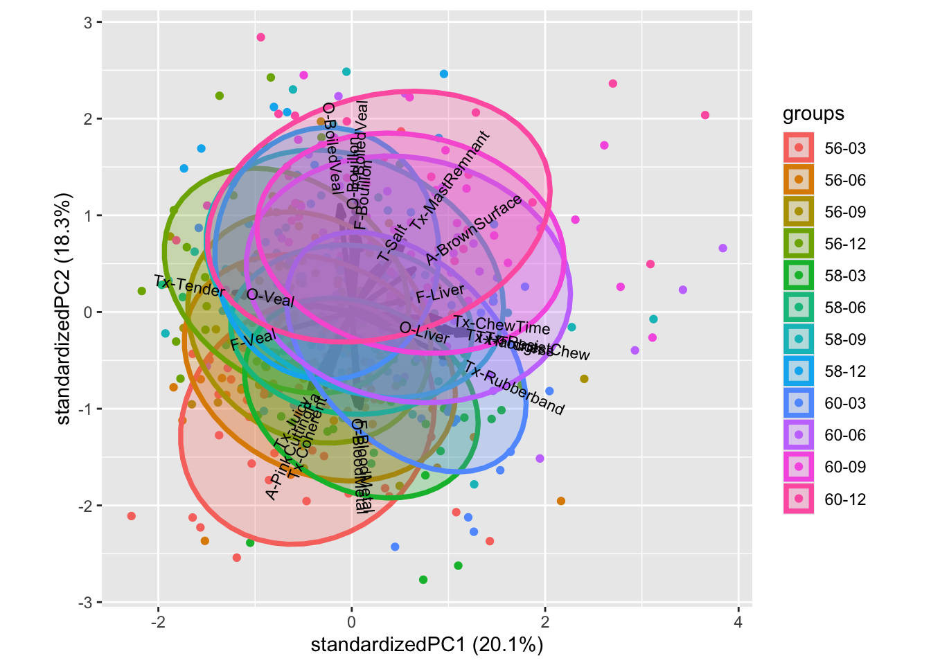
We can decorate the scores with design information, such as beef type as well as judge

All though this plot is a bit messy, we see that higher temperature promotes higher position on PC2: I.e. moving from bloody to bouillon. While PC1 to some extend captures trends in cooking time.

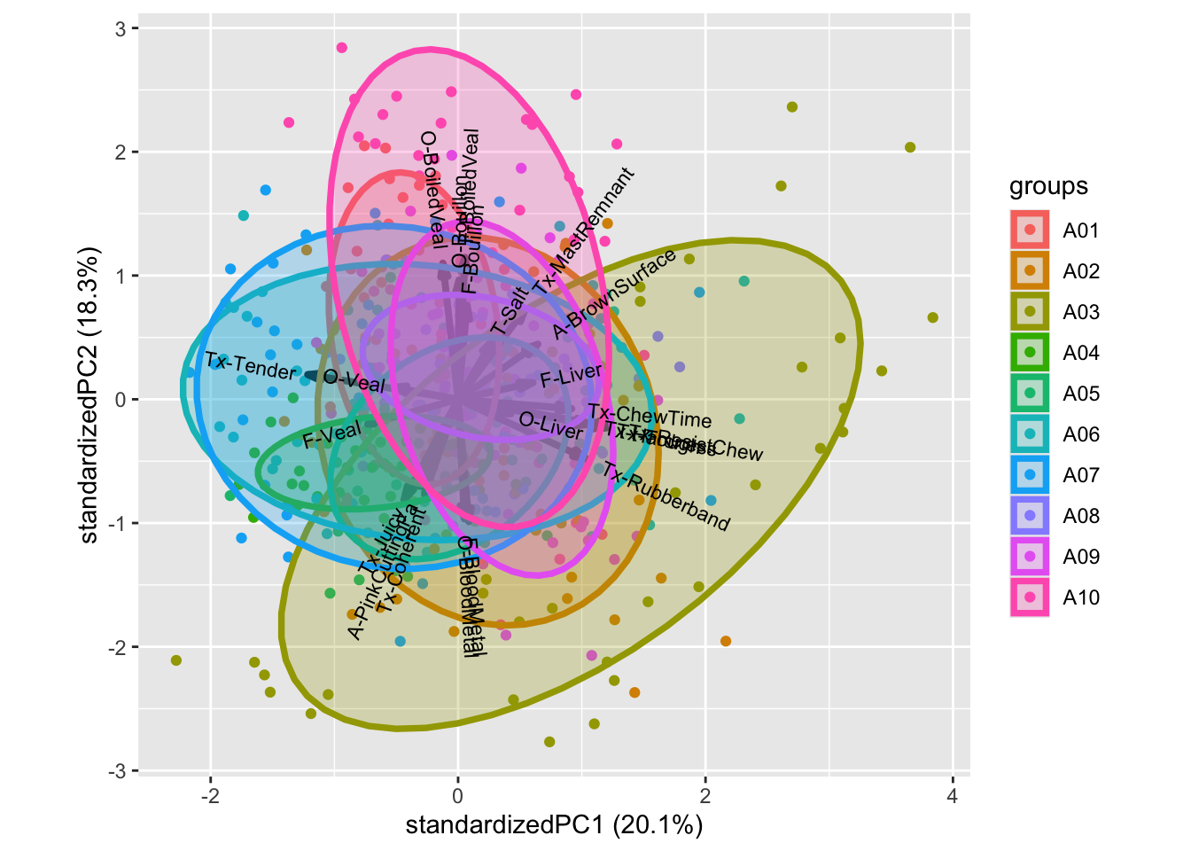
Coloring according to judge reveal that judge A04 is low in range (variance), and hence do not utilize the entire response scale, A03 tends to rate higher on rubberband, chewtime, bloodmetal, etc. especilly compared to A10, which is higher in bouillon / PC2. This plot indicates how well trained the panel is, as we optimally have only smaller impact of the individual judges.
NOTE: If the ggbiplot() needs modification, for instance, if the loading labels are exceeding the boundaries, or are too small, then look into the ggbiplot arguments such as varname.size. Also normal ggplot2-functionallity like xlim(), ylim() or theme() can help to modify the plot.